The Conductor
Click the pic for a bigger view
Back in July we spent our summer vacation in Durango Colorado. We crammed a lot in during our stay. Everything from white water rafting to horse back riding. One of the adventures we did in between was ride the Durango and Silverton narrow gauge train. If you ever visit the area this is a must do.
The train makes daily trips from Durango to Silverton and vice versa. It’s a fairly lengthy ride but well worth it due to the scenery. And not to mention the nostalgia of riding in an old train. Woohoo for the old school way of traveling!
Click the pic for a bigger view
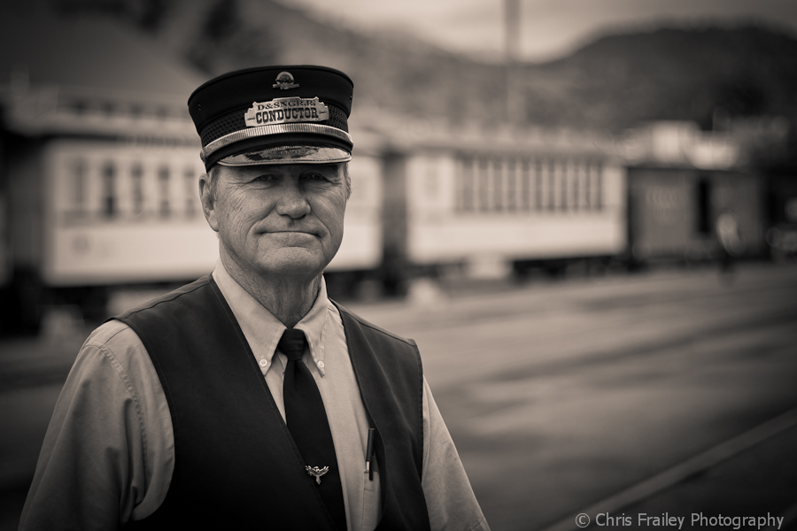
While we were waiting around for our train to depart I snapped this shot of our Conductor. The gentleman was very gracious and accommodating when I asked. I’m sure he’s told that “it is a part of the job” but nonetheless I thanked him. I shot this image at a wide aperture as I wanted just him in focus against the train in the background. After processing the image in color and b&w I was on the fence to which I liked better. My original thought when I shot it was “this will look great in b&w”. However I do like the yellow background of the train.
So I will offer up something I don’t normally do, both images are presented for your vote. I would love to hear your thoughts.
Until next time…
Camera: Canon 40D with a Canon 50mm prime
Processing: Lightroom 3


I like the b/w shot, but the shadow from the brim of his hat makes it a bit hard to get all the details on his face. I am a sucker for shots that look older, and it certainly rocks that department. I wonder if I can get a hat like that for my father-in-law.
The shadow I struggled with a bit. I was going to lighten it some but thought it was a little more natural with the low brim hat.
Really cool shot of the conductor. I like how you kept the total focus on him, the background blur works very well. Both are great shots but the B&W carries the “old school” mood and connection to yesteryear.
Good stuff, Chris!
I vote the tinted shot. Looks very nice.
This a tough choice, they’re both great! I like the nostalgic feel of the b/w but the colors in the first image are sweet and the DOF is wonderful.
Hey Chris, great write-up. I love that train ride. The conductor sort of looks familiar. Anyway, great shots of him. I’d go for the color one for two reasons – first his face pops against the color of the train and second, the train itself becomes more the image.
I like ’em both a lot, but that B&W one really rocks the house, my friend!
Great image chris! I am drawn to the color image…it has a certain snap to it over the black an white….nice!
Looks to be abfairly even split so far. Here’s another votebforbthe color. Both his skin tones and blue shirt set off very nicely against the yellow train cars.
Colour shot for me – I think it gives slightly greater depth and love how the conductor pops out from the yellow background.
That a great environmental portrait. Very well done.
Tough choice. The bw is fine, but the color version is riveting! And that Durango and Silverton yelloe is iconic, like Coca-Cola red. I vote color! Also, the composition and depth of field are spot on. I agree with your decision regarding the shadow.
Excellent blog! Do you have any helpful hints for aspiring writers?
I’m planning to start my own site soon but I’m a little lost on everything.
Would you advise starting with a free platform like WordPress or go for a paid option?
There are so many choices out there that I’m totally confused ..
Any recommendations? Thank you!
Thank you for visiting my page. I would go with a self hosted WordPress.org site. You get more options with plugins and stuff. This will cost some money but totally worth it.